
To me the Summer is about fun and brightness. Luckily, there are still several days left because the following five new identities should have waited until the darkest days of Winter to be revealed or kept hidden and written off as a Summer fling.
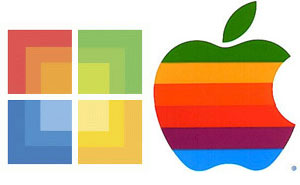
I can understand that Microsoft wants to create a special variation of the Microsoft logo to be applied to its new retail stores. However, the “new” design reinforces that Microsoft is still following in the footsteps of the MAC—looks eerily similar to the old Apple logo, just squarer.

There has been quite a bit of backlash as IKEA changed its highly recognizable, customized version of Futura font (IKEA Sans) to Microsoft’s omnipresent Verdana typeface. The goal for its 2010 catalogue was to leverage the same font for both the print and online versions. Designers around the world are outraged and have started petitions to force a change back. “Ikea’s image not only loses originality, but also credibility and the reputation that the company has built since the 1940s,” says Vitaly Friedman of Smashing Magazine. “They went cheap,” said designer Iancu Barbarasa. “Designers have always thought of Ikea as one of their own, so now, in a way, the design community feels betrayed.” For me, will the furniture style follow down the path of being non-descript?
BANK OF AMERICA and MERRILL LYNCH
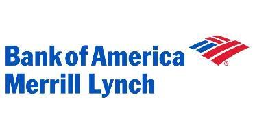
Another example of a non-compelling, undifferentiated effort is Bank of America’s decision to drape its red-white-and-blue flag all over its new “partner”, Merrill Lynch. This master brand strategy represents a total takeover not a merger. The iconic, inspiring Merrill Lynch bull has been put out to pasture. I believe the positive equity in this incredible asset could easily have been leveraged for the good of the company and the country. Instead, this symbol of positivism will only be shared with the wealthy (Global Wealth Management clients)—once again contributing to the gulf between the “haves” and the “have nots”.
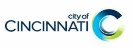
I was caught off guard with the unveiling of the City of Cincinnati logo. I was ready to see an acknowledgement of the nineteenth-century Italianate architecture and/or possibly the Reds baseball team. Officially, the lowercase letters (for some reason limited to the words “city of”) and the morphing of the C from dark to light colors have been used to communicate a more approachable and progressive image. For me, this $75,000 effort by LPK and financed by Cincinnati-based retail store Macy’s is uninspiring and difficult to understand. A missed opportunity for America’s first Boomtown in the heart of the country.
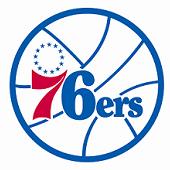
For the Philadelphia 76ers basketball team, their “revitalized” look is actually “retro”, a step back into the past. The hope is that the logo worn during the two championship seasons of 1966-67 and 1982-83 will somehow be a magic cape for the players. I am a big believer in the emotional power of branding but it can’t play defense and hit jump shots!
by Allan DeYoung